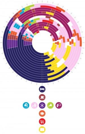
I love information graphics. It’s a great challenge to look at data and develop a way of presenting it visually so that it immediately communicates meaning and entices the viewer to look closer to glean more information.

As a research chemist eons ago, I found that I drew a lot of pleasure diagramming experiments in my log book. This was long before I explored in more detail what Philip Morrison calls “cognitive art.” Philip and Phylis Morrison popularised viewing the cosmos from the very small to the very large by taking snap shots in scales of 10 in their book, Powers of Ten: About the Relative Size of Things in the Universe.
![Redrawn from Akahata [Red Flag], Tokyo, 1985 for Edward Tufte, Envisioning Information 1990 Graphics Press](https://imbueddesign.files.wordpress.com/2016/02/anticyclone-e1456528781435.gif?w=760)

Many years later as a graphic design student I discovered John Maeda, who has used computer programming to render complex abstract art. John Maeda created Design By Numbers (DBN), a designer friendly programming language, which has inspired many designers to create art from numbers.

Information graphics developed at David McCandless studio shows us fascinating relationships between datasets that are not initially obvious, in his book, The Visual Miscellaneum. Its a great coffee table book with intreguing and beautifully presented snippets of information covering a wide rang of topics from appetite to world affairs.

In the expansive data sea of the internet, information graphics is a lifeboat in which to explore our world with curious minds.
